In the big gap between my last post, everything came to a head and the semester ended. I continued working on "The Camel's Back" after classes completed in order to get it to where it is now (below):
It's looking a TON better than it was. There are still so many little things I would like to improve, but seeing it here compared to its last incarnation is really motivating. In shot 4 you can see these mountain-kinda-thingy's in the background, and I think that looks really nice. Maybe I will repeat that in some of the other shots where you can see the horizon.
But, for now I'm going on break. Before I get back into the visuals I think it would help if I put a little distance between me and the imagery. Maybe I will work on sound next. Until we meet again, Happy Holidays!
I still have some animation stuff I could tweak, but I have to keep moving if I want to finish by the deadline. I painted a texture for the camel, and I even did a couple procedural textures for some of the props. I would really like to use n environment light and Sub-Surface Scattering, so I did some experimentation. As you can see the results are beautiful and dramatic...
... but the render times are out of control! I was averaging about 40 min - 1 hr per frame with this configuration. Here is the lighting pass I have just completed for the first shot (reference imagery after the jump):
This is no longer using SSS or Environment lights, and I cut my render times down to about 1 - 4 min. per frame. what a difference!
You may notice that this shot doesn't match the original storyboards. I did a little camera tweaking after consulting with one of the upper-division grad students who specializes in that sort of thing. I think the new look is much better.
I spent some time tonight tweaking my shader for the rider.
He's looking a little glossy, and I am not sure how to get rid of the black line on his nose or the rings around his eyes (they come and go), but this is a step in a much better direction than the earlier version. He's got a few close-ups; I've gotta make him look nice.
Here's the lighting key for my first shot. the idea is to give direction to the kind of lighting scheme I want to use throughout. I'm also uploading a 3D sketch of how I tried to implement that scheme.
Some photos of my textured models in-progress. Most of it is looking pretty good, but the rider needs a little work. Something about the specular properties are not going like I thought it would. More after the jump:
I have included my texture reference for the main characters. I've got a big challenge ahead of me with the unwrapping process in order to get variation between the skin and the costume of my "rider" character, but the camel is pretty straightforward, since it's not wearing any clothes.
And here's the rider:
And this is the color I want to use in the background:
The "Motion" phase of my animation is now complete, which for me means blocking and main actions of the characters. I'll leave secondary actions (breathing, facial expressions, etc.) for later if I have time. Now, it's time to progress to textures and lighting! I relied pretty heavily on the storyboards for my visual reference here. How do you think it looks?
In Time-Based Media we had to reconstitute imagery and sounds from at least two other movies to make a new movie. I decided to extract Arnold Schwarzenegger from The Last Action Hero and transplant him intoWoody Allen's The Purple Rose of Cairo. The content of the films is very similar, so I thought I would have an easy time putting them together. It was much more challenging than I thought, but I'll let you watch the video before I continue talking about it:
The rigging is on its way! This is the rider's skeleton. Next I will bind this to the model, and begin weight painting. Classmates say this is a long, cumbersome process.
It finally happened: our models are due! Of course I will continue tweaking them as the project goes on, but for the most part they are finished. Here are some of the final designs I used to create the models, and then I'll show you the models after the jump: In the next post:
The project is complete! I think it was mostly successful. The biggest error that was pointed out in class is the spill from the overhead light. At the end of the 10 seconds, once the actor (who did a wonderful job) enters the moody blue light, he leans over, and catches the down light on the back of his head ad shoulders. A quick relight could have solved this, but as my only complaint, it's not so bad. It's a little different from the Network scene I was paying homage to, but it's it's still pretty close! You can see it below:
The next project we are doing increases to 10 seconds long, and must contain (within a single shot) a transition from high key to low key lighting (or vice versa). When I was just typing the title out, "High and Low" made me think of the Kurosawa movie of the same name. I can't remember if there's any instance of this kind of transition in the film, but I do like it a lot! I might have to give it a re-watch soon...
There was a scene from Network which contains a great transitional moment like this during the speech Arthur Jensen (played by Ned Beatty) gives to Howard Beale. I'll include it below the jump. The reason it came to mind is because the lighting change is so dramatic and theatrical that it really draws attention to itself. But, I don't think it destroys the illusion of the film world for the following reasons: we are kind of swimming in Howard Beale's headspace (which dir. Sidney Lumet slams us into with the ECUs of his eyes) and the dogmatic writing of Paddy Chayefsky (this movie really is firing on all cylinders!), the melodramatic staging. They all create an atmosphere of such high tension and drama that I totally buy it!
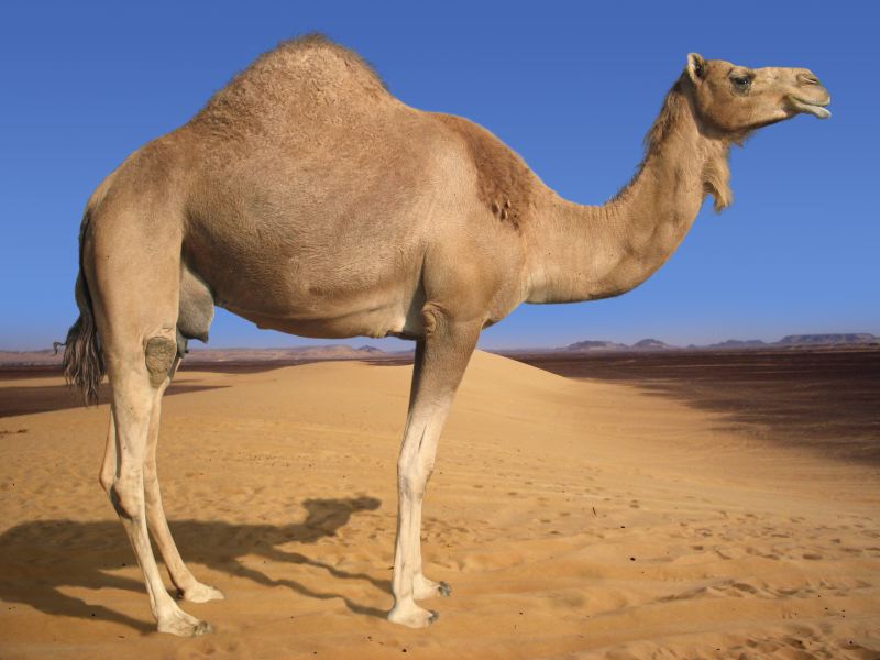
So, we're on our way with the camel story! Now all I have to do is make the movie. It's all downhill from here... The first part of that is the character design process. I began working out some cartoons based on a Google image search for "camel head," and I realized I was totally grasping at straws. I thought a good place to start would be some basic dromedary anatomy.
You can see Goofy peeking out back there! I used his face as a reference to try and make the camel appear a little more likeable. The latest faces look most like the first design, except: no hair, lower ears, higher nose, and eyes spread out a little more. I like it though! Let's run with this one...
This assignment was to create either a gestalt or ambiguous character introduction. I struggled a little with this one. I had an idea that I was working towards and trying to make work. The character was a computer programmer, but a villainous one. Maybe even diabolical! It just felt a little weak to me.
So, the morning of the project, I changed my idea. I couldn't get this shot from M out of my head. Professor Lafayette showed it in class, and although right on the nose, it is also elegant and a masterful use of light and mise en scene to tell the story. I know my homage to the movie is a little straighforward, but here's the storyboards I came up with:
As you might have noticed from the storyboard album, I began experimenting with color a little bit. Color is going to be an important part of the story, I know, but I also really wanted to draw with the Wacom Cintiq that they have in the lab, here. It's really fun!
So, I went to this website, colorschemedesigner.com and I made some mood boards for the characters and the setting. This is a really cool system, and it spells out the RGB data for each color when you hover over it, so you can plug them right into Photoshop or wherever you want to take it. I will link them below:
I still need two more props to meet the minimum requirements. I think the ladder could definitely count as one, and I was also thinking that there could be a complete tea set at the top of the pile, instead of just the single teacup. I'm open to suggestions!
This weekend, I also turned the storyboards into an animatic movie! I needed to do this to judge my timing, and I'm pretty pleased with the pace! I know I have lot of work ahead of me with the modelling and lighting and everything else, but it's a comedic movie, and comedy is nothing without timing, so it is integral to work that out first! Without further ado...
It's hard for me to think about camels and the desert without thinking about Lawrence of Arabia, which is why when I began to draw out my storyboards I did them in an anamorphic format. I think seeing the desert through those lenses creates a distinct sensation that I want to grab a hold of:
The design of the camel will have a unique set of challenges, because I'm tempted to sketch until I approach realism. However, It looks like the best way to go in order to allow to camel to deform and move around in a humanoid way (in his face, anyway), is to make him a bit more cartoony. Here's a good comparison
I like this design a lot (I didn't draw it). Especially because of the skinny legs.
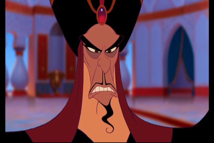
As for the rider, it was starting to look to me like a cross between Jafar and the Witch from Spirited Away. I like the proportions and the nose of the witch, but Jafar has distinctive facial features (bags under the eyes, cool wardrobe, etc.) that I will try to incorporate.
OK! This is it, loyal followers. I think my new class at Texas A&M, VIZA 613 will finally get me to update my blog regularly. We have been strongly encouraged to present our work for class in a blog format, and since I have already made this one beautiful, I decided I would continue working on it. So, Here we go!
Our assignment was to choose an idiomatic expression, and from that idiom we have to make a 30 second animation. We will be taking this animation from script to screen, and it will be entirely ours. I chose "The Straw That Broke The Camel's Back."
I was originally nervous about modelling a camel, but I think I made my story in such a way that the camel doesn't have to move too much. I've got two characters, the camel and the rider, but what are they going to look like? Here's some process sketches.


.jpeg)